Amplicon practical

Learning Objectives
What does an amplicon sample contain?
What does it look like?
What is the scope of amplicon analyses?
What is the impact of using different tools?
Download an amplicon sample
The European Nucleotide Archive (ENA) is a public, open-access repository at the EMBL-EBI for storing, managing, and sharing all publicly available DNA and RNA sequence data. We will base the amplicon side of the practical on a sample from oilseed rape seeds.
https://www.ebi.ac.uk/ena/browser/view/SRR5527446 –> download selected files. We will focus on a sample
Set up your Galaxy account and workspace
The Galaxy Project is a free, open-source, web-based platform for data-intensive scientific research, especially in bioinformatics, that makes complex analyses accessible, reproducible, and transparent for researchers without requiring programming skills. It provides a user-friendly interface to run thousands of tools, build workflows, manage data, and share results.
 Steps:
- Navigate to: Galaxy
- In the upper right corner click on “Register” and go through the steps (skip if you already have an account).
Important: make sure you activate your account by clicking the link Galaxy will send to your email address. - Create and name your Galaxy history:
- Find the history panel on the right-hand side and click on the “+” to create a new history (its default name will be “Unnamed history”)
- Click on the name and change it to “Amplicon practical”. It should look like this:
- Find the history panel on the right-hand side and click on the “+” to create a new history (its default name will be “Unnamed history”)
Log-in to your account.
In the top-left corner, find the upload button, and submit the amplicon sample you downloaded.
![]()
Quality assessment with FastQC
Assessing datasets quality is an essential step if we aim to obtain a meaningful downstream analysis. We can do this by looking at the raw sequence, which is usually stored in a FASTQ file. The FASTQ format is a text-based format that contains the raw sequence returned by the sequencer, and quality values associated to every base pair.
FastQC is tool allowing you to observe sequence quality and content quickly.
Look up FastQC in the list of tools on the top right corner, and launch it on the sequences that you uploaded.
FastQC returns two types of outputs: a raw file and a pre-made html file containing multiple graphs with information about the sequence. Download that file, extract it, and open it in your browser of preference. FastQC provides information on various parameters, such as the range of quality values across all bases at each position.
The first section of a FastQC report is a summary for all quality checkes tested by the tool.
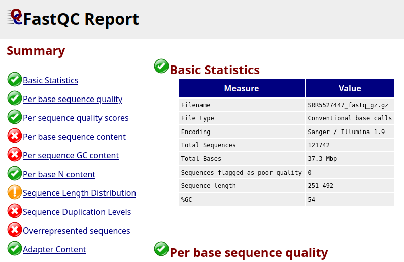
It looks like not all the checks passed, let’s look at a few of these more in detail.
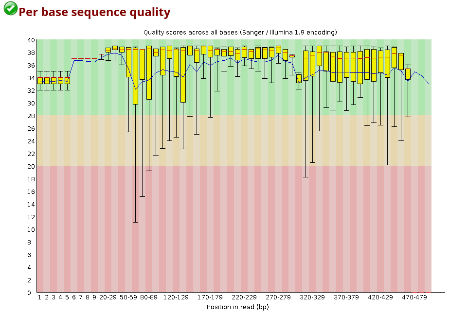
For each position, a BoxWhisker-type plot is drawn:
- The central red line is the median value.
- The yellow box represents the inter-quartile range (25-75%).
- The upper and lower whiskers represent the 10% and 90% points.
- The blue line represents the mean quality.
The y-axis on the graph shows the quality scores. The higher the score, the better the base call. The background of the graph divides the y-axis into very good quality calls (green), calls of reasonable quality (orange), and calls of poor quality (red).
Looking at the plot above, what does the quality of the sample look like?
The majority of the base sequence quality values falls into the good-quality section of the graph, and only the lower side of the whiskers is sometimes falling in the red region.
You can also look up the distribution of the average quality per read in the sample:
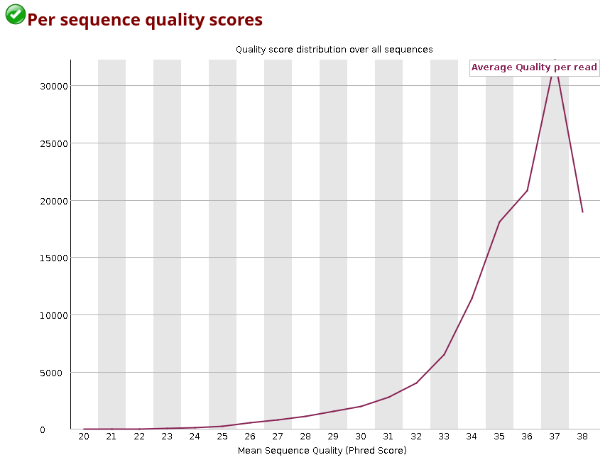
You can observe how the distribution of amplicon bases is much more scattered compared to a metagenomic samples. This is usually because amplicon sequencing targets specific regions, leading to a higher chance of the same base position containing the same base.
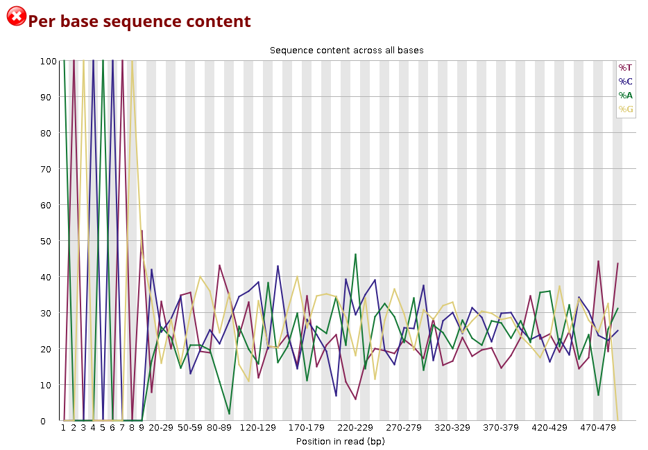
The DNA composition looks very even until nucleotide ~10, and after that, there are distinct differences. Why do you think that is?
The first bases in this sample are primer sequence. In amplicon libraries, all reads start at (nearly) the same position because PCR primers define the amplicon boundaries. This means that the same primer sequence (or its reverse complement) is present at the start of almost every read, leading to a highly uniform per-base sequence content. After nucleotide ~10, the biological target sequence begins.
There are a few other summaries in this report you can look into. You may notice that a few of these summaries are labelled as failed (red cross), but this is not an error for amplicon sequences, as we are mostly targeting repeated sequences, and duplication/GC content expectations differ a lot from what a metagenomic sample would yield.
Performing taxonomic annotation of your amplicon data
In the following section we will compare results from two different tools that we will launch on your amplicon data: Kraken2 and MAPseq. You will observe how the choice in tool and reference database can change results drastically.
This step is needed to proceed with downstream analyses. Fasta files are fastq files deprived of their quality values.
Look up FASTQ to FASTA in the list of tools
Analyses names can be a bit confusing in galaxy - to remember which files you are supposed to use in downstream anallyses it is recommended to rename them by pressing the pencil symbol on the analysis, and then editing the Name to something you’ll remember easily.
MAPseq
MAPseq provides a fast and accurate sequence read mapping against hierarchically clustered and annotated reference sequences.
From the MAPseq repo:
MAPseq is a set of fast and accurate sequence read classification tools designed
to assign taxonomy and OTU classifications to ribosomal RNA sequences. This is
done by using a reference set of full-length ribosomal RNA sequences for which
known taxonomies are known, and for which a set of high quality OTU clusters
has been previously generated. For each read, the best guess and correspoding
confidence in the assignment is shown at each taxonomic and OTU level.
Look up MAPseq in the list of tools, and select the SSU database, as this was the targeted subunit, and default parameters.
We ran the sample against LSU and ITS databases, but the yield was very low, as expected.
Among the available options, there is the possibility of creating a table suitable for krona plot generation. This will be used later for a visual observation of your dataset.
Kraken2
While MAPseq is based on seuqence alignment against a reference, Kraken2 is a k-mer based taxonomy annotation tool. This means that every sequence is split in k-mers and searched against a database to identify which taxa matches it the most.
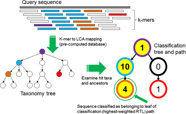
Look up Kraken2 in the list of tools. Keep all parameters set as default set of parameters, with the exception of:
Enable quick operationwill make processing faster by only using the best hit.Select a Kraken2 database- use SILVA from 2022 (the most recent SILVA instance on galaxy)
In a separate session you could try changing these parameters and aim for better accuracy, bearing in mind that execution time might increase.
Kraken-report + Krakentools
A few more steps are required for kraken data to be converted to a format ingestable in a krona plot.
First, select ‘Kraken-report’ from the list of tools, and give it the Kraken classification file as input. The tool will only run for a few seconds. Do the same with ’ Krakentools: Convert kraken report file to krona text file’ by giving it the file ‘Kraken-report’ just generated.
Krona pie chart
Use both tabular files that have been generated by MAPseq and Kraken2 as input files. This tool will generate a separate plot for each dataset.
Kraken2 vs MAPseq comparison
Open the two krona plots you just generated. They should look like these two:
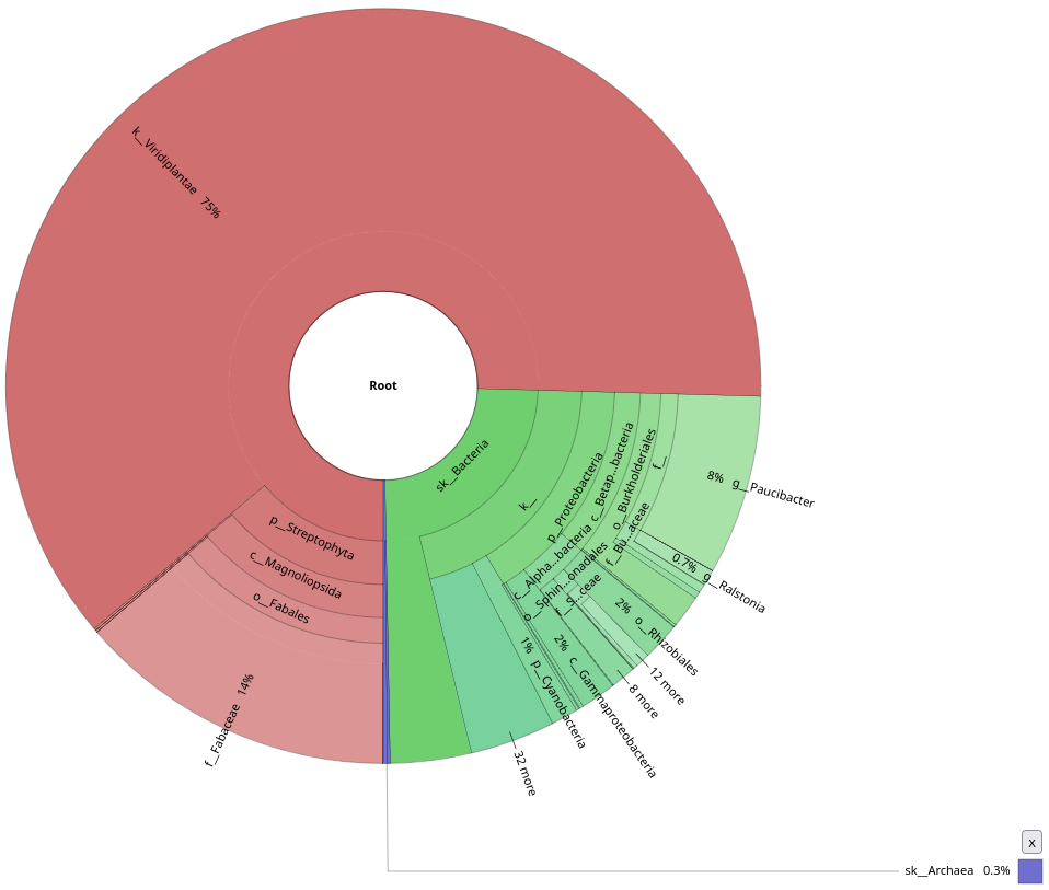
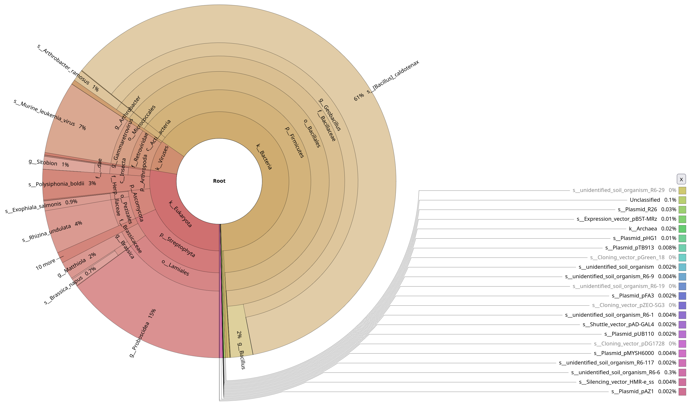
Notice the contamination on MAPseq’s output, and the difference in annotation numbers between the two (to be found in the top-right corner). Thinking about the parameters that we used, do you understand why this was picked up by MAPseq, but not by Kraken2?
Kraken2 was only focused on a bacterial database, while we used a generic SSU database for MAPseq. Also this shows probably how much contamination there was in the initial sample, underlying how important it is to decontaminate your sample beforehand.
Let’s focus only on the bacterial annotations by clicking on the Bacteria sections of the plots.
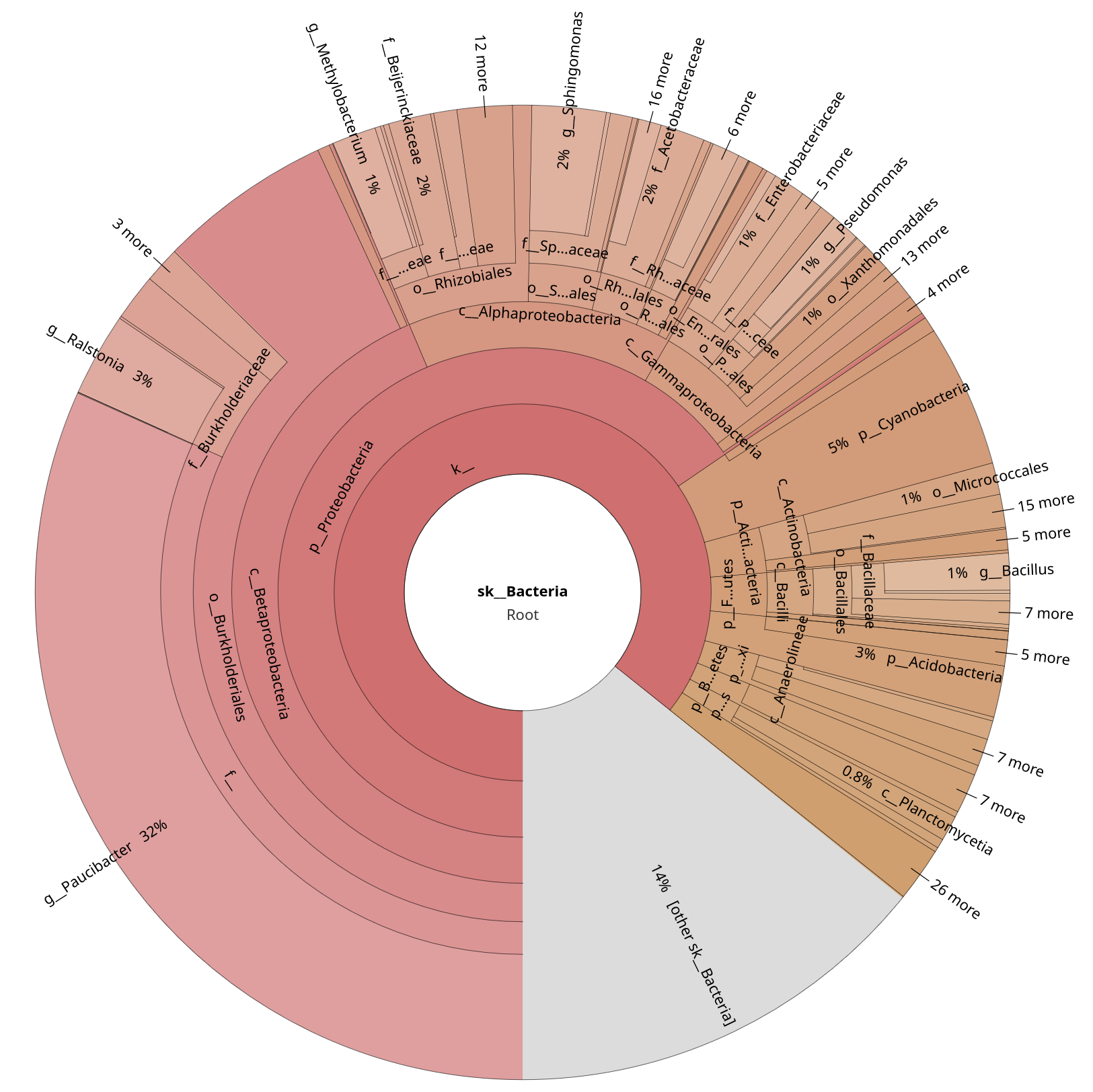
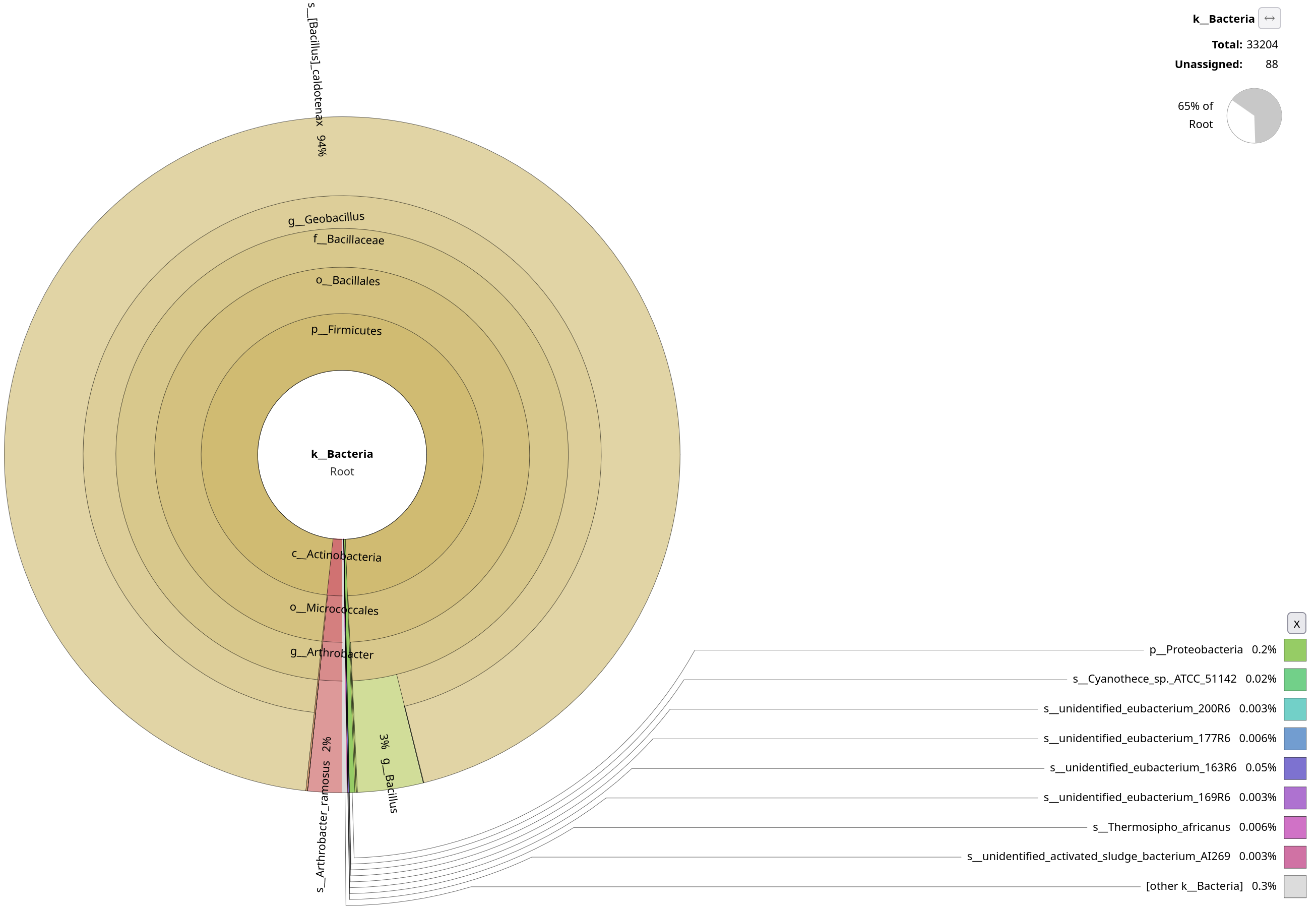
Quite clearly, Kraken2 wasn’t able to pick up as many annotations as MAPseq. You will explore this in more detail in the metagenomics section, but why do you think Kraken2 doesn’t work as well on amplicon, and it’s probably better suited for metagenomics data?
Kraken2 is k-mer–based, and looks for exact matches against the reference. While MAPseq fully aligns sequences, Kraken2 assigns reads based on shared k-mers. This makes Kraken2 very sensitive to conserved regions.
On top of this, Firmicutes are known to be a bit too overrepresented in SILVA, and Geobacillus is known to have many near-identical SSU entries. While Kraken2 is a permissive algorithm, MAPseq is very conservative, as it has to deal with highly repetitive sequences. In fact, only ~1-2% of MAPseq’s results are reported to belong to Geobacilli.